Tuesday 21 December 2010

Update


As you can see, I've added a Twitterbox to my sidebar. And a tweet by Annadenise.nl reminded me that it would be more consistant to use the same name for all my accounts. Which means I've changed pinterest.com/floddertje to www.pinterest.com/wijeisenijs, so now you can find us at: wijeisenijs.blogspot.comwww.twitter.com/wijeisenijs and www.pinterest.com/wijeisenijs. That's easy, isn't it?

Sunday 19 December 2010

Tweet

I've created a Twitter-account. I figured that the combination of limited time/energy, lots of commuting time and a new Iphone could be very well used by keeping you guys up-to-dated. But since there isn't a good blogspot app, I thought a Twitter-account could be a nice addition to this blog and my Pinterest page. I'll try to add a Twitterbox to this page soon. For now, you can follow me on http://twitter.com/wijeisenijs. Hope to see you there as well!

For now a belly picture of 16 weeks....

Friday 10 December 2010

Surprise, surprise

I know you haven’t heard from me for a long time, but I had a good reason. I was to tired to post anything because…I’m pregnant! I’m so happy! We had to wait for over a year to get pregnant, and sometimes I still can’t believe there really is a little baby in my belly now. I’m feeling quite good, I’m almost 16 weeks pregnant now and my energy is starting to come back a little. What remains is pain in my lower back, so I can’t really work on the house now. And we’ve just started rebuilding a room on the first floor. We’ve taken the walls and ceiling of that room down and my husband now has to rebuild it on his own.

I hope I’ll be able to post more often from now on and I’ll show you some pictures of that room then as well. For now, just some recent Iphone poleroids.

While I was too tired to write anything for this blog, I did read blogs from others now and then and have been pinning my favourites to my pinboards on Pinterest and I will continue doing that, so, even when it’s quite here you might find something new there….

Friday 12 November 2010

Just a little more patience


I know I haven't posted in a while, but I have my reasons and I’ll tell you more about that soon. In the meantime, you don’t have to do without me, because I do post on Pinterest once in a while, because that doesn’t take time at all. So check out my pinboard on Pinterest!

Monday 30 August 2010

Sometimes it's just waiting for you on the street...


Where I live, there's an antique and thrift market every weekend in the city centre, and there I just bumped into this dresser. I really like it!

Friday 20 August 2010

What about Pinterest?

Recently I learned about the existence of a website called Pinterest. Many of you probably know this site but for those who don't, Pinterest is a site where you can "pin" all the interesting things you find on the internet on your own virtual pinboards. For me, it seemed like the perfect solution for all the pictures and links that I am saving on my computer, and the one at work, and on my husbands notebook, my Moleskines, and of course my favourites on Etsy, Google Reader and so on. Of course, when I am looking for one of those images I can never find them. And when I do, I don't remember how I got them, which is not so nice if you want to show them on your blog and give proper credits. So from now on, I' am using Pinterest. I'm still pinning things from all the sources I mentioned above, so apologies if I missed some of the credits. Hopefully I'll do better with this new tool.
Anyway, I’m allowed to invite five friends to Pinterest, so leave a comment if you want an invite!


Wednesday 18 August 2010

Art journal try-out


This summer I went to Stockholm (tell you more about that later) and soon after that we went to our summerhouse near the sea. My mum was there too and she brought some postcard sized aquarelle paper and water-soluble crayons. I wanted to try them and with Stockholm still fresh in my mind I made two postcards in art journal style. I like the result, and it is a great way to keep memories alive, so I might try to start a little art journal later this year.

It would be a great way to use the many hours I spent in the train commuting to work. I need to find other materials though, because the crayons I used (Caran d'Ache) were not really suited for the job to my opinion. The good thing of the crayons is you can use them without water in the train, and than finish it with water at home. However, when using such a small paper size (A6) I need something that you can use for very detailed work. And since small paper is easier to carry with you, I might try markers or perhaps aquarelle pencils. But I am afraid the colours won't be bright enough then. What do you think?

Sunday 15 August 2010

Screenprinting class (4)


This is the final print I made in my screenprinting class and the one I am most proud of. It took me a couple of lessons and a lot of drawing, copying, cutting and glueing but it was definitely worth it. I didn't use the computer at all, so it was a lot of work.


And even though there are definitely things that could have been done better, like putting the birds in a straight line instead of slowly bending down to the right corner this is the first print that I really like to show to other people. It is a great feeling when you wear your own printed shirt and people compliment you on your shirt and you can say: 'made it myself'. Yay!

Thursday 29 July 2010

Nestje bouwen (building out little nest)


I was hoping to a nice looking To Do list would look a little less frightning and in fact it's working!

Monday 26 July 2010

New haircut


I went to the hairdresser last weekend and I asked her to cut it short and curly, but still long enough to make a little tail.  Her idea was to cut it shorter in the back than in the front. I liked the idea, because when I see other people with haircuts like that I always thinks it looks nice. But I was always a little scared to do that, I thought it was a little too experimental for me. However, I was in a holiday mood and said yes. And I like the result, although it's a lot shorter than she promised me. It was much longer before the cut, so my husband was very surprised when I came home. Of course he prefers it longer. What is this with guys that they always like long hair?

Friday 23 July 2010

…and inspire to cut some new ones.


The shades of green and the shape of my Cat’s Eyes ink pads inspired me to cut some new stamps. I know it’s not the most original design, but I think they are great to experiment with different colour combinations.


Wednesday 21 July 2010

New inkpads make my old stamps shine…

I bought some new colourful inkpads from Colorbox and the colours are amazing. Beautiful shades of green and turquoise, and bright orange, yellow and red. They really make my stamps shine. I immediately made some cards with my own handmade stamps and I love the result. Only next time I will use cards with a little less texture, because the ink cannot reach every spot. I like textured paper better than normal paper though, I think it adds to that handmade feel. But I need to find a compromise, paper with just that little texture, don’t you think?

Monday 19 July 2010

I've won!


I've won one of these Fossil bags on The Bright Side Project. I've taken part in many of the giveaways on this site and now I've won, I'm so happy. I posted something about the sweet memories when listening to that old holiday mixed tape of the past, something that we seem to have lost with our Ipods and their never ending playlists. And with that I won this prize.  I haven't heard back from the Bright Side Project yet, so, I don't know which one I'll get or when, but I'm secretly hoping for the turquoise one. Although the other one is great too. Lucky me!

Friday 9 July 2010

Screenprinting class (3)

In the next class I wanted to try a two-colour print. I didn't have much inspiration for a subject, so I drew my house. This time I really found out how hard screen printing is. I spend four lessons, each three hours, and to b honest, I am not happy with any of the prints. Unfortunately I didn't get much help of the teacher and I lost a lot of time waiting for other students who were using the tables, or the materials. Anyway, it was a good experience, I had fun making my prints and I have some nice prints now.

These are some test prints that turned out better than the real prints. I used some scraps of paper for them, on which the yellow and blue circles where test-printed by some-one else.

These two are the best result from the red and orange series. Unfortunately, in the left one the red paint was a little too fluid which ou can see for example on top of the left window and in the right one there are some strange stripes in the blue paint. Most likely, the paint I used was a little thick, I should have added some water. And I didn't hold the squeegee under the right angle.


Wednesday 7 July 2010

Going to Stockholm


I am going to Stockholm in a couple of weeks! I am really looking forward to it. It's the first time I will visit a Scandinavian country. From what I've read about it, it think it will be amazing for art, design and vintage lovers like us.

Have you ever been to Stockholm? Any advise on what we should visit? Thrift shops, cafes or restaurants? What are nice magazines to buy? What are nice Scandinavian brands of clothing? Do you need a public transport card or is everything in walking distance? I'd love to hear from you.

Sunday 4 July 2010

screenprinting class (2)


On my third screenprinting class I tried to print a cushion and a towel, but it was more difficult than I expected. Especially to put the screen on the exact right place turn out to be quite difficult. I wanted to make multiple prints on the same fabric, but after the first print there is paint both on the fabric and on the screen, so it's not possible to try where the screen should be, because paint gets everywhere.


For the towel it put tape on the whole screen except for one line of oranges. I think it turned out quite nice even though the line isn't straight.


BTW, I tried to lighten up the photos in the online photo editor on photoshop.com. I don't understand how these photos get so dark since the room they were made in is a very light room and it was a sunny day. I tried everything using different kinds of exposure and white balance. Anyway, I think it looks good enough to show here, but I wish I was able to take better pictures.


Thursday 1 July 2010

Collage experiment

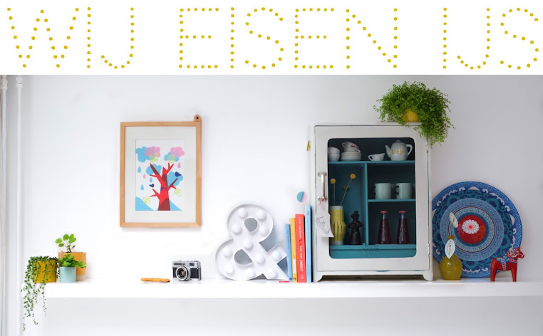
I try to keep things a little chronological here, but I am hopefully behind with showing you the results of my screenprinting classes and the latest stamps I have made. That has everything to do with my awful skills in photography. I just can't get the photos right so I can't show you anything.


However, yesterday I made a collage and immediately photographed it and it turned out fine. The white wall is a little darker than in real, so I probably should edit it. But the colours look good and  if I wait until I have time to edit this will become one of those post that stays on my computer forever, so I just show it now as it is.

(Have you heard about fashion  magazines that have a 'no photo-editing' logo on their cover because they don't make models look better/skinnier than they are? Perhaps I should use that logo to on my blog ;). Although, now I think about it, the fasion industry has great photographers and while some of them edit to make people look better than real, I have very limited photograph skills and would use editing software to try to make the object in my picture look as good as the real thing. Conclusion: I should buy a good camera and sign up for a photography course. Or just make things that fit in my scanner.

But back to the collage. Sometimes nice package material inspires me. Especially wrappings of drinks and snacks are very appealing to me. Not surprising, as I love to eat! Anyway, when I see a nice label or something in a cafe I take it home with me. In my mind, I always make nice collages with them, but today I made one for real!

I used Ninainvorm's tutorial (sept '09) for 101woonideeen for inspiration. I had never made this kind of collage before and I thought it would look good as the background for the labels I had collected. It was more difficult than I expected but I loved doing it. I started with a A3 sized white sheet of paper, because the labels are quite large. Soon a problem arose, because I don't have a large paper collection. I used every nice paper I have in this colour combination and it took me two days, but now I am quite happy with the result, especially for a first attempt (except for postcard sized collages).

I had some problems with finding the right balance between the colours, textures and patterns. I didn't want to make it a boring piece, but I didn't want to put too much different things on it either. Somehow, it think if you would draw a line from the left corner above to then right corner below, the part above the line is more successful than the part below. What do you think?

Next time I might stamp the collage with some of my hand-carved stamps, to  make it a little more 'mine'...

Wednesday 30 June 2010

Sale!


It's sale in my favourite shop Exota, so I bought two shirts, a cardigan and a dress! I just couldn't resist...

Sunday 13 June 2010

Italian magazines

Speaking about international magazines, in Florence I bought two Italian magazines. Of course, I can't really read them, but the pictures speak for themselves and I am able to find out what is written about the products (brand names, price, stuff like that). And that's enough, isn't it?


I didn't want to spend a lot of money on them, since I can't read them anyway. So I just choose some of the cheaper ones. There were many to choose from, so that wasn't a problem. I think the magazines are much cheaper in Italy than here in the Netherlands. The Casa Facile spoke to me right away, and was just 1,90 euro so I choose that one. The Hachette Home was packed in plastic, so I couldn't flip the pages, but since it was just one euro, I bought that one too.
It seems like there are more ads in it than in the Dutch magazines, but maybe that's just because the ads are new to me, so I might notice them more.

I don't know which one I like better, they are both good. If I had to choose, I would say the Hachette. I guess the CF is a little more low budget and DIY, like our Dutch 101 Woonideeen and the HH comes a little closer to our VTWonen. I really wish I had bought more magazines....


In the HH I saw a picture with a little stool in it that reminded me of Wood&Wool stools, which I adore. I love it when there are hand-made items in magazines, especially if I know them from the blogging world, it feels a little familiar right away. In this case I am not sure if it really is a Wood and Wool stool, the size seems a little different and I can't find the name in the texts. I will ask Irene of Wood& Wool Stool on her blog.

Wednesday 9 June 2010

try-out

Last year in London I bought an Elle Decoration magazine. Inside was an advertisement by Ford that somehow attracted me. I started painting it but never finished it until today.


I hadn't done any painting for a long time and just used some old paint, both gouache and acryl, from my childhood. The result is far from perfect, but I do like it. What I also like, is that during this one painting, I saw my skills improving. I know some of you like it when I tell about the 'mistakes' I make and about what makes me learn, so here we go...


For example, the big flower was painted a couple of months ago, the other ones today. I definitely like the small ones better, especially the right one. There's more dept in it, I made much more use of dark and light colours. You can also see it in the background, I started down left and worked up to the right corner. Down left there are too many brush strokes visible to my opinion.
I finished with the branches, which I think are the best of the whole painting

Maybe I should try more, and see what I can come up with. If I only had more time....

Tuesday 8 June 2010

New furniture

Recently I bought some new additions to our living room.

The chair was bought on 'Marktplaats'. That's the Dutch version of Craigslist. The plaid is a bit too large for it, so I need to buy some nice pillows or something, but I am very happy with this.

The little red vase I thrifted in a second hand store in Delft, just as the plaid. The yellow lamp was bought on Modcloth. I saw it in a post by Deedee and I had to buy it. So I went to Modcloth and immediately bought it, without thinking. When the package arrived, it turned out I had to pay a lot of taxes and the plug doesn't fit our Dutch socket. Still have to fix it. But I love it and I think it looks really good on my grandma's desk.

Modcloth claims it's handmade, but i've no idea by who.
I guess some of the stuff Modcloth sells can also be bought here in Europe, but I've no idea how I can find out if an items is also sold by other shops. Does any of you know how to do that?

Sunday 6 June 2010

Florence


I went to Florence for a couple of days with my mom. It is such a beautiful city. Last time I went there was ten years ago, when I went on an Interrail trip to Italy with my boyfriend. I remember very well how impressed we were with al the amazing art. It was the first time I saw these kind of things. Since then we have visited many beautiful places and I was very curious how I would look at the same things with more experienced eyes.

It turned out that the things I had remembered all those years were the things I still loved most. All the other things I had simply forgotten, but all memories came back when I saw them again. And with them a lot of good romantic memories of our first big holiday together.

So I had a very good time. I also noticed that this time I noticed the beauty of the more ordinary things much more than the first time, when I was just amazed by all the famous stuff.


Tuesday 25 May 2010

Sneak peak


Left: before, right: after


Left: before, right: after


We are still working on the living room, but I wanted to show you a little sneak peak. Hope you like it so far!